Operation redesign complete. Check it out: RheaDrysdale.com.
I used Quadro from Elegant WordPress Themes. Then I customized it with my She-Ra colors from Twitter. Who says red and pink clash?
Next I upgraded WordPress, my giant heap of plugins and my content. The new theme required a Thumbnail image for each post, so click through the categories and enjoy, I had fun making them.
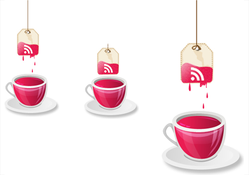
When I nervously asked my good friend, Matt Inman, the genius behind a certain notorious online dating site, if he could review my blog he asked if he could design a custom RSS button for it. Um… duh! I don’t think it gets better than that. I’m one of Matt’s biggest fans (regardless of what all of the widget haters have to say), no one makes unicorns farting glitter cooler.
Below are Matt’s initial designs based on my infatuation with tea and when you look to the right to subscribe to my blog, you can see the final concept.
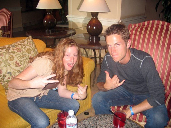
Love it? Want your own badass custom RSS button? Matt wants to make more of them (because they’re fun!), so shoot him a message on 0at to hire him. Yes, I said hire, despite his charity with my blog, you probably aren’t BFFs (yes, we’ve had a pillow fight… no, that’s really a terrible lie)! We have had some embarrassing moments together though, like this one:

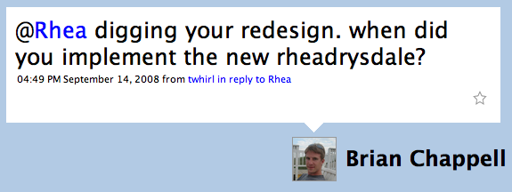
After Matt graciously donated my rocking button, I spent a couple of days stumbling through design tweaks after Tony, Michael, Aaron and Cameron took the time to give their thoughts on ways my blog could not suck. Thank you for your expert feedback! I’m still making numerous adjustments from alignment to site architecture, but while the changes trickle in amid spare time, it became apparent that I could no longer keep the new look a secret:

Jeez Brian, way to out me for actually paying attention to my blog! Google Analytics and I were under the impression that no one visits – look, I even wear my low RSS subscription count with pride:
Have any ideas on ways I could make the blog even better (besides actually blogging, something I truly detest)? I’d love everyone’s thoughts and if nothing else, your subscription if you aren’t already making love to my silence on the blogosphere.


September 16, 2008 at 1:56 pm
Love the new look Rhea, and Matthew did a awesome job on the RSS icon, first thing I noticed. 😀
September 16, 2008 at 1:57 pm
Oh man, I love that photo. Totally gnarly.
September 16, 2008 at 2:09 pm
The redesign is very tight Rhea.
The only kind of feedback I might add is moving your “popular posts” section near the top (on the sidebar maybe?) whereas to attract more attention to it.
September 16, 2008 at 2:12 pm
Brian, agreed. Cameron brought that up initially. I’m CSS tarded though, so I’m still figuring out the aesthetics behind that. Hope to have it completed later today. Besides visibility, it has to have some SEO benefits…. shh, I don’t talk about anything of value on this blog!
September 16, 2008 at 9:58 pm
Congrats – On the redesign. Clean, and just cool (Keep it comin’!)
September 17, 2008 at 9:45 am
Nice design! Very slick